Water
- Agnieszka
- Nov 26, 2020
- 2 min read
Updated: Jan 11, 2021
I am continually interested in way of bringing art into interiors in order to shape them and evoke certain feelings. I used to live just next to a beach for a few years and I always miss sea when I'm not by it for some time. It's one of my happy places where I feel alive. This is a reason why I wanted to bring it into my home environment, to be able to gaze at it from one of my favourite sitting spots.
I thought of printing out a sea surface I could attach to a cupboard.
I found a photo and adjust its size to match cupboard door . I wanted to work in CMYK- using colour separation technique.

I thought it would be a quick 2 day little thing, but the whole process took a few weeks. Getting layers sorted, accessing screen print spaces, preparing big screens, waiting for paint to dry before adding another layer, experimenting, not achieving the result I was after and adjusting my idea- all that took quite some time.
It did make me confident in printing on a large scale. I finally got the colour I was after (after changing the main concept a little) and I also got very excited about unrealistic colour layering -just experimenting and seeing what happens. I have not finished playing with possibilities due to lock down and will hopefully get another chance to come back to it.
Here's my process:
The photo of my choice had had mainly blue and yellow channel visible and each of them made a separate layer ( below those 2 channels I made screens from). There was no black apparent and magenta was hardly visible. With some help I got magenta layer adjusted for the printing process, but it just a few flickers of it showing in lights.
My initial idea was to lightly misalign the layers so that the final image would be mainly turquoise, with slight edges of blue, yellow and magenta showing.

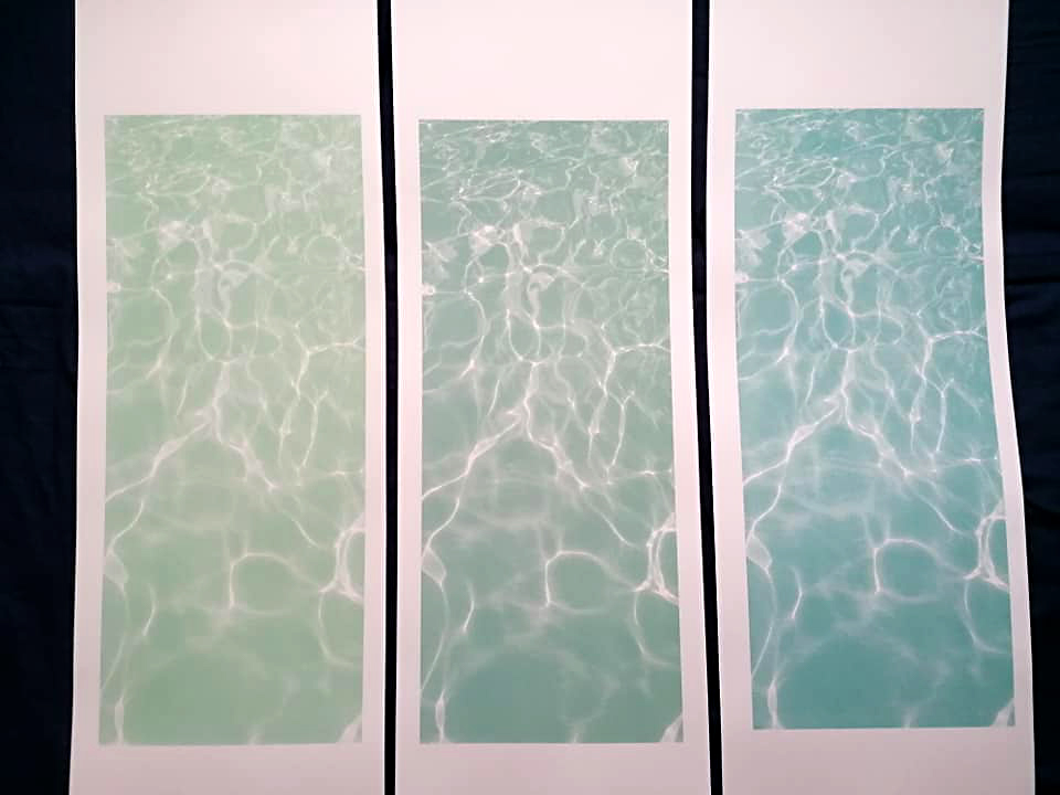
Here are blue and yellow channel separately and printed together (on the far left). Misaligning layers didn't look nice and with without magenta in midtones and blacks, I wasn't getting the effect I imagined. I decided then to get a print that would fairly resemble the original photo. It was really tricky to align even 2 layers together as the format was big I I had to literally slot tiny pixels into one another. Unfortunately the final colour seemed too saturated and intense when I brought it back home to see how it looks with the rest of the interior. Having gone so far, I was determined to keep going

I also started randomly playing with various colours- it hasn't got me to any pleasing result yet, but got me some indications what to mix net


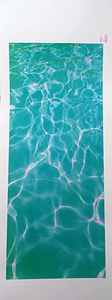
Running out of time I decided to simply focus on blue channel, which gave enough of visual information to feel that the sea was realistic. I mixed 3 similar colours and that's the result:
I was happy with these and felt like I could stop at this point.


Comments