small scale line explorations
- Agnieszka
- May 3, 2020
- 2 min read
Updated: Sep 30, 2020


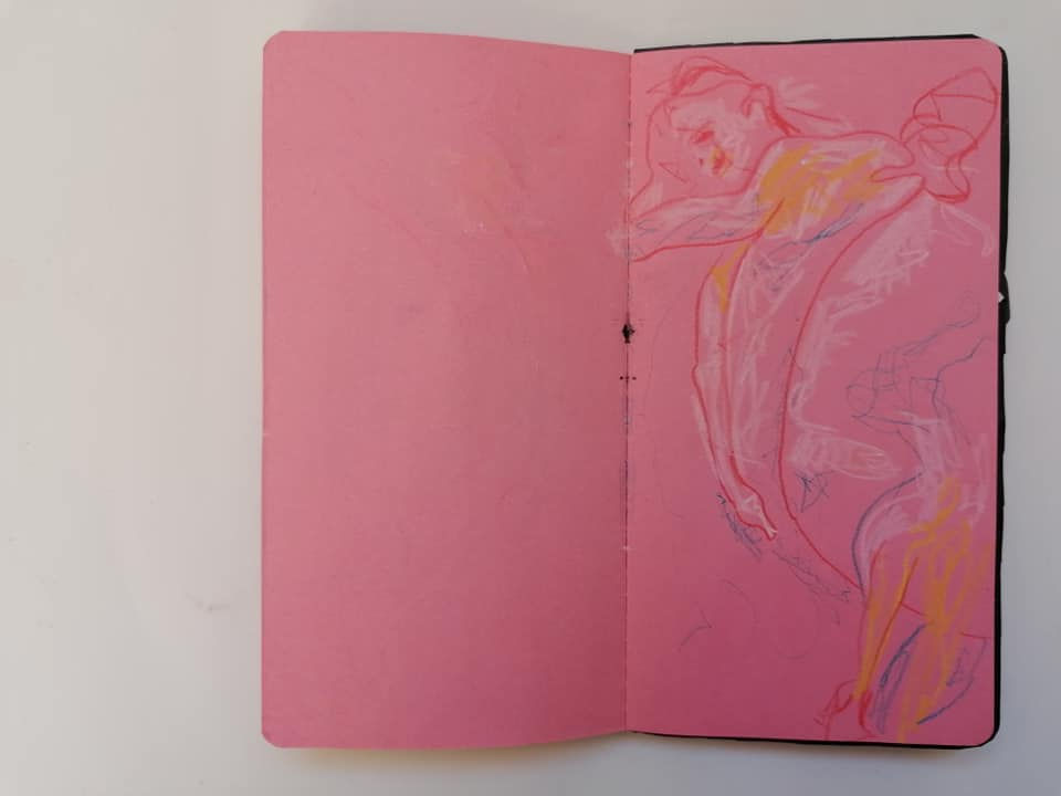
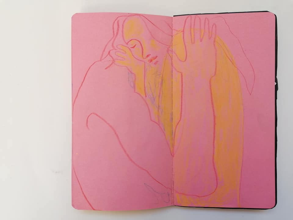
This is my small sketchbook dedicated to line experimentations. I was playing with pencils, pastels, cut outs, inks, watercolour pencils. I was trying to layer some of them and see what happens, what effect they can create. I referred to few photos, repeating the images a lot, just changing quality of lines, allowing myself to make mess and draw/paint over an image multiple times. It was interesting to see that many images that I didn't like, could be transformed into more pleasing composition, simply by playing further and adding more layers, and the final one would be actually complemented by initial 'mistakes'. Obviously, that won't always be the case, but being playful till the end can bring some pretty nice results.

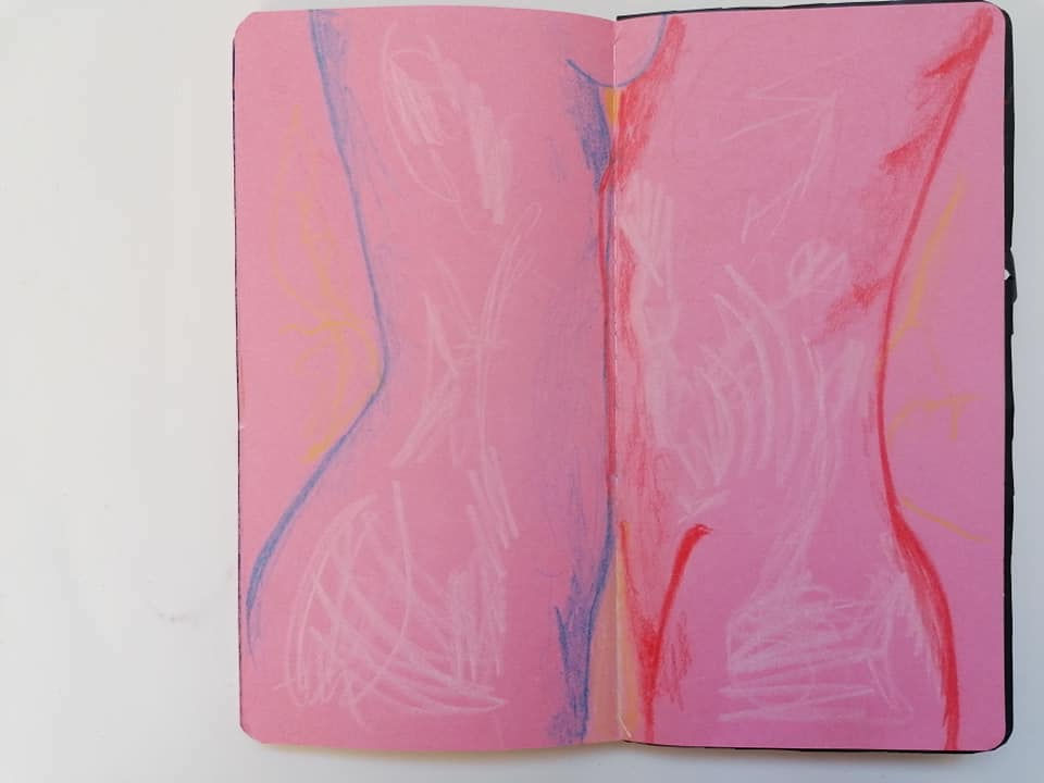
I liked the idea how pages can relate to one another and hide/reveal content.
I also thought of possibly turning this sketchbook into little 'intimate book' of illustrations to flick through and make it playful by cutting parts of pages in-between illustrations.

Many of line approaches were inspired by a book by Peter Boerboom and Tim Proetel "Figure. Drawing Methods for Artists. Over 130 Methods for Sketching, Drawing and Artistic Discovery".
Below is one of prompts from the book.
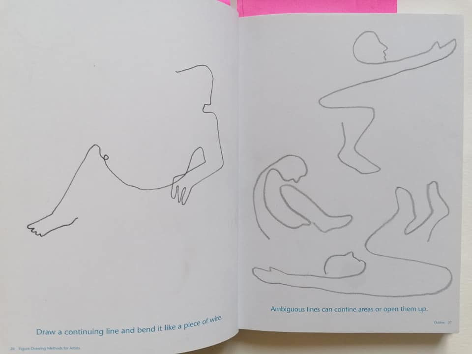

I love how fun and playful line can get and how you can set yourself for treating her in such way simply by adhering to few restrictions. One stops worrying then how accurate the drawing is. The focus is on finding lines within the picture that can embody the shapes just enough for a viewer to know what they represent, whilst continuously bending the line in pleasing way.
It reminded me 'found drawings' exercise a little.
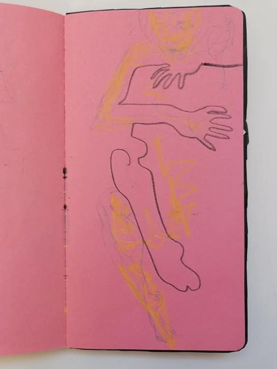
I tended to go through some of the exercises from the book and then drift away from them and modify them.

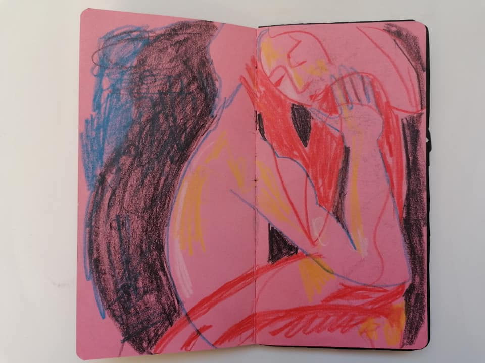

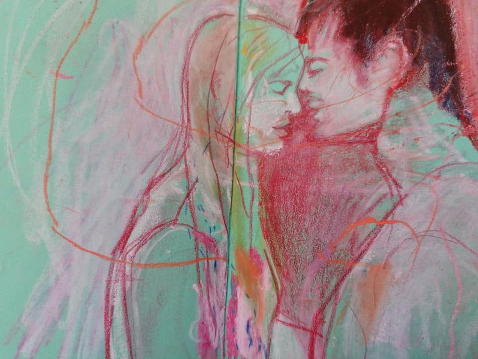
I like how the outline of the people can be created by the white shape in a background.
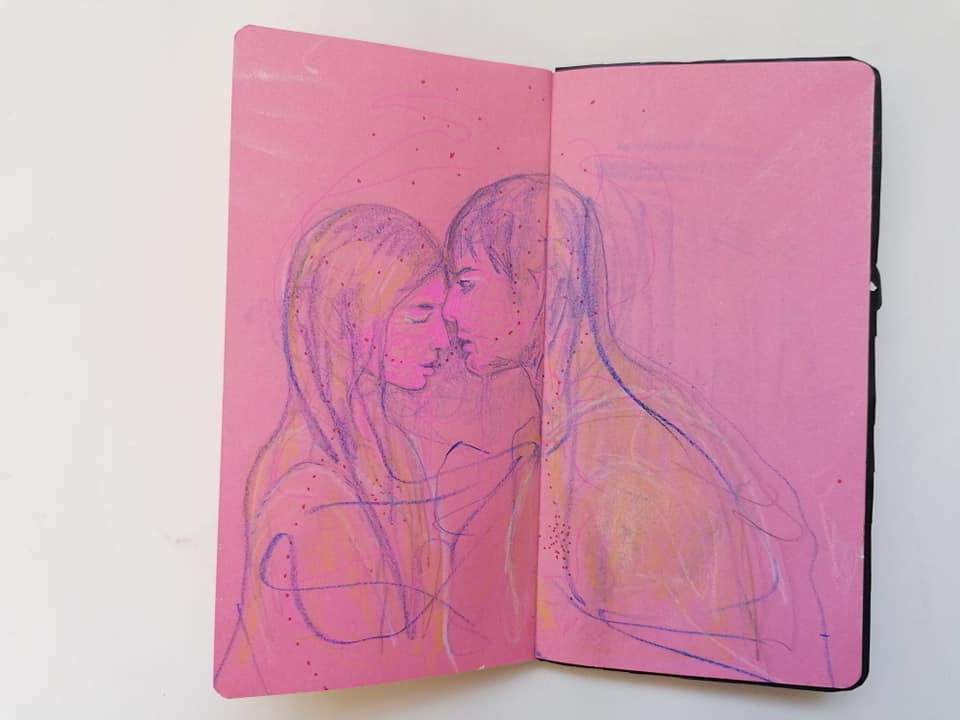
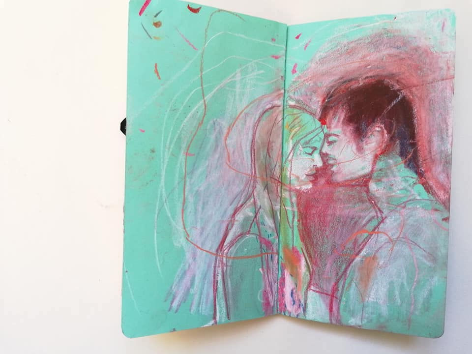
Playing with dots symbolising energy exchange.

Layering textures and revealing shapes at the same time. Red squiggles symbolise hearts and feelings.

Thinking in terms of negative/positive space and how few lines can build the image.

Reversing the cut-out and messing around with marks more. Going too far just to see what will happen.

Another take from the prompts plus previous elements of visual vocabulary.


Going over and over again. I like the effect of contrasting powdery pastels on a shiny black ink.
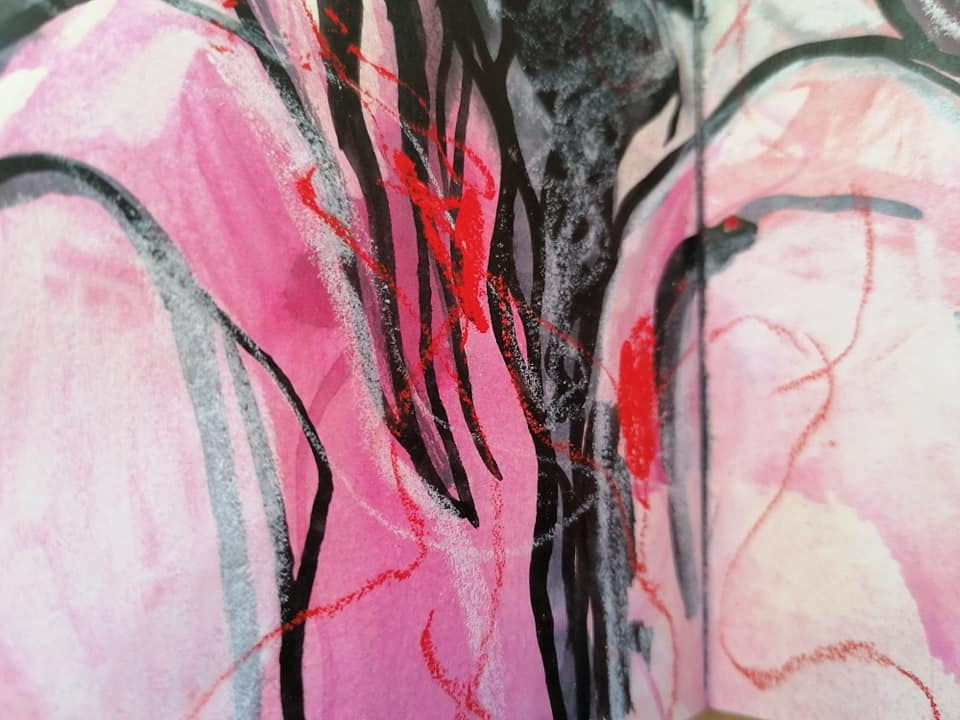
Building up on one of previous experiments I play more with an effect I really enjoy: making dense marks with white compressed charcoal over red watercolour pencils. I like the depth any kind of haziness they create. Plus adding more and more energy lines showing dynamics of energy exchange.

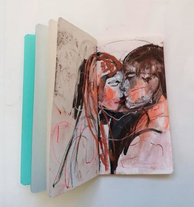
Ink, white compressed charcoal and super soft and 'oily' pastels. I like the variety of textures and richness of feel of pastels, plus the colour palette, which is simple, quite dark, yet warm and 'positive'.
The end. For now


Comments