Colour
- Agnieszka
- May 3, 2020
- 2 min read
Updated: Sep 30, 2020
During colour workshops with Mark I learned to see colour in seemingly colourless area. Exercising seeing this way made me notice more. It was fascinating and served as a base for more abstract versions of reality.
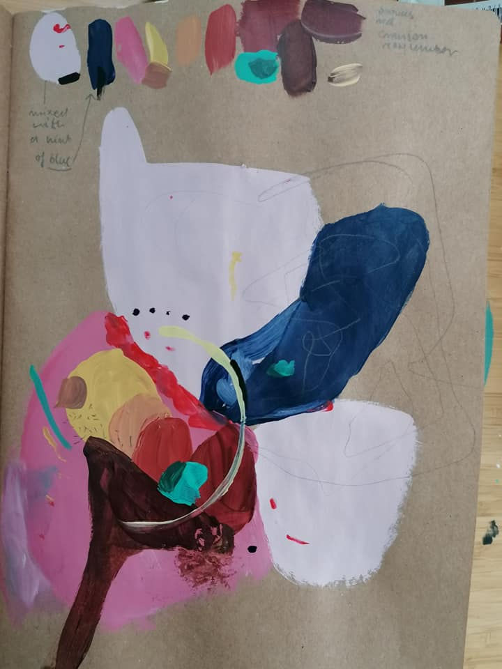
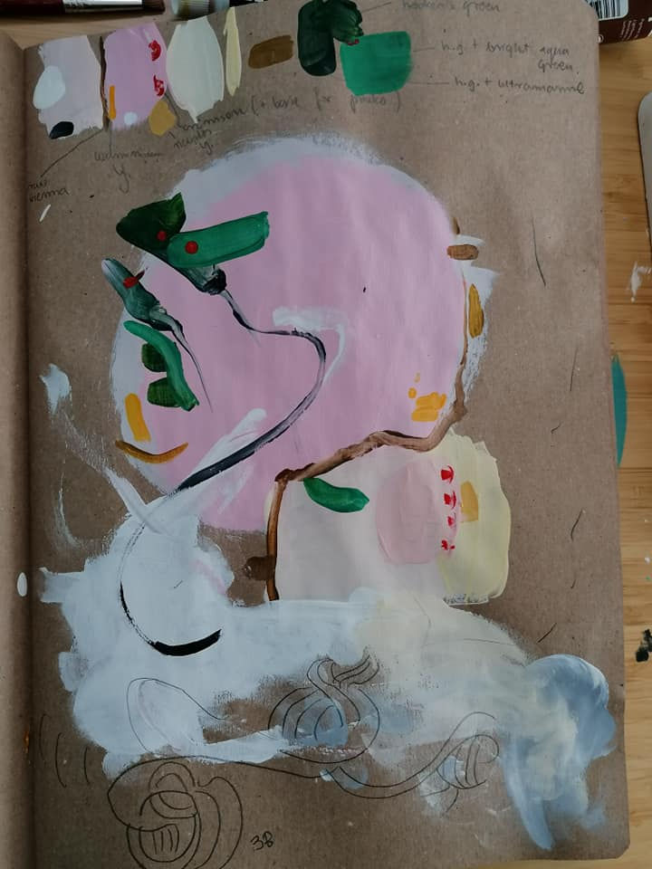
'White' objects piled up together and my perception of them when actively trying to look for more colour.


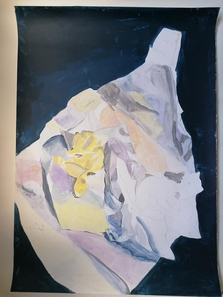
Seeing colour in space. The aim of this exercise was to solely focus on colour rather than proportions and 'correct' shapes. We were meant to show how our eye sees-more detailed where the focus is, bigger in the front and warmer in the front, plus aerial perspective of objects getting less clear and less saturated with the distance. It was good to remember how relative perception of colour is and how all the colours live together in dynamic relationships.

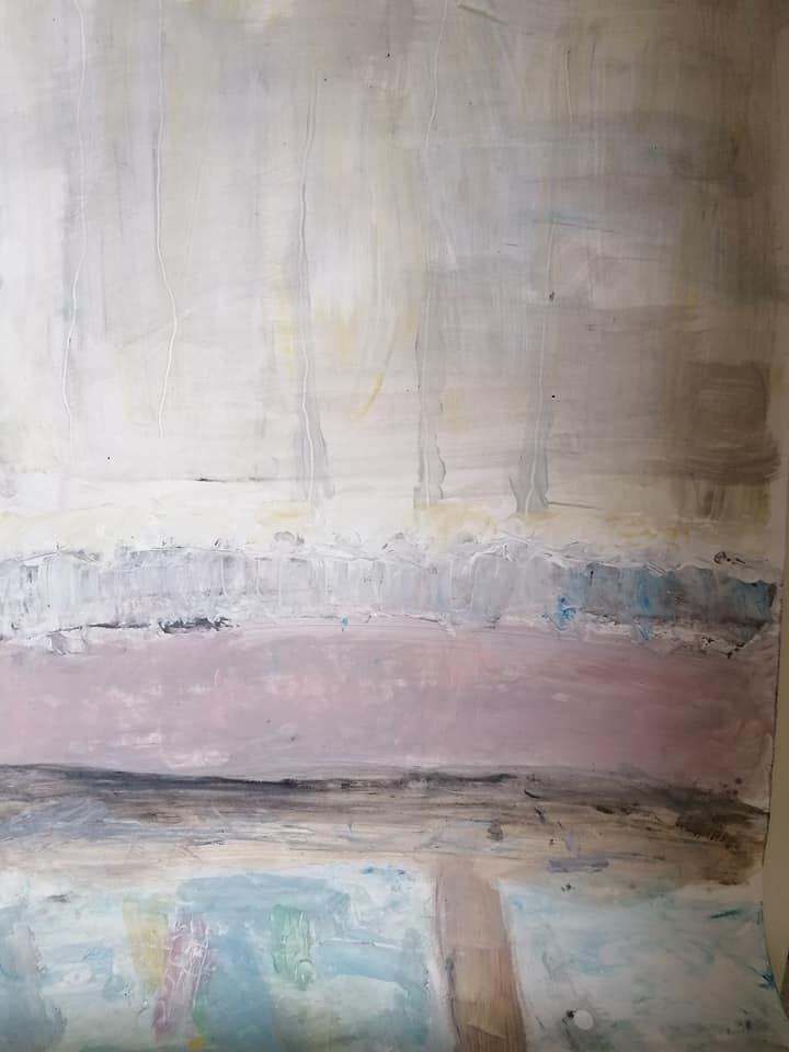
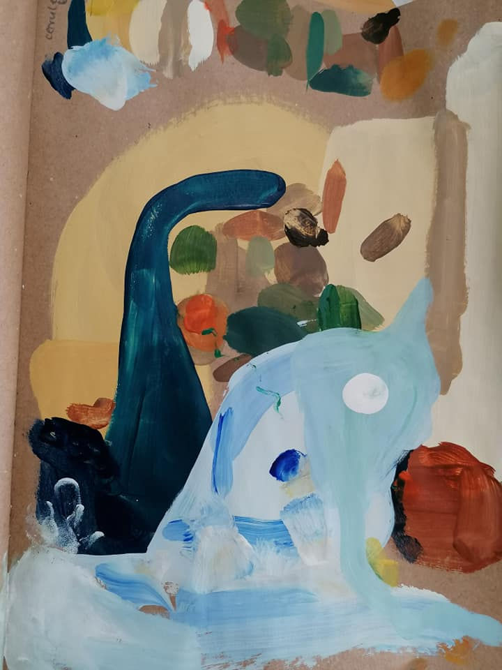
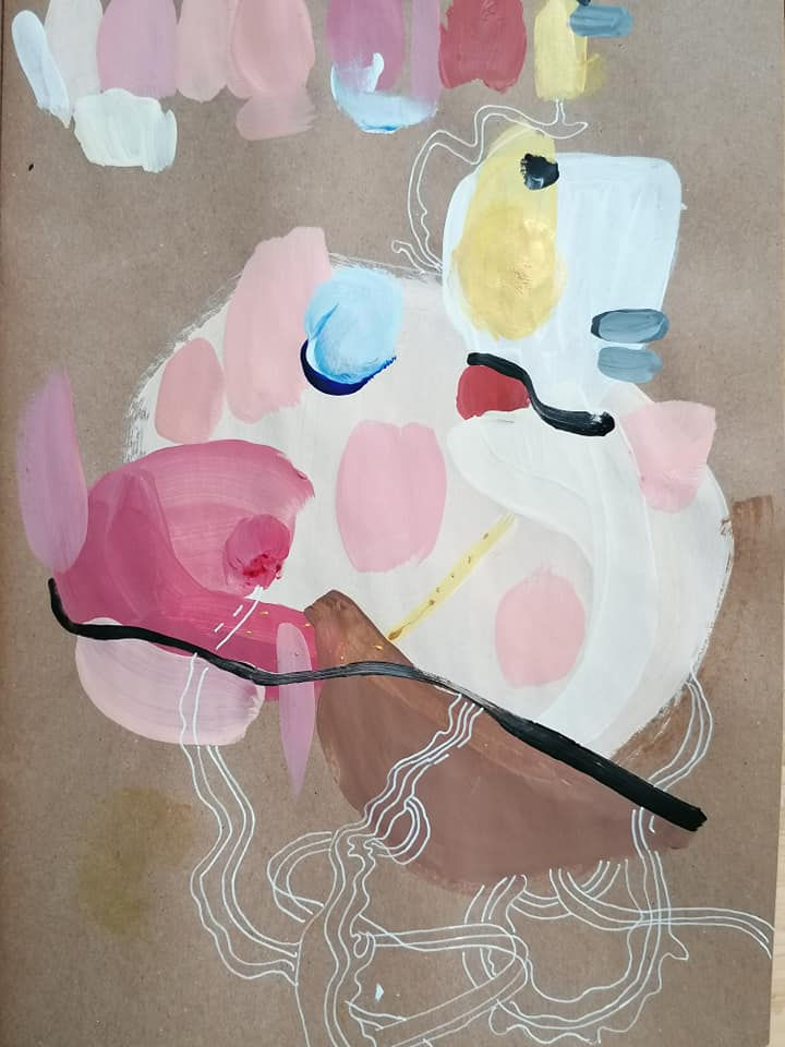
In this exercise we were looking for our favourite colour palette and painting highly subjective landscape from memory.

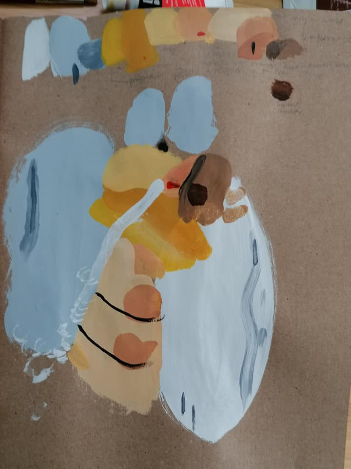
Mark pointed out how flat everything is with pink underpainting and to try painting without it. He also suggested to do a quick study of composition to see what works first before committing to a decision. I was really indecisive as to what marks to make in my first landscape and this advice helped a lot. Here is my quick study:

Knowing it was just a study of dynamics and proportions, I allowed myself to be more free and daring with it. I was pleased with this study and was ready to take it to a bigger, more detailed attempt.
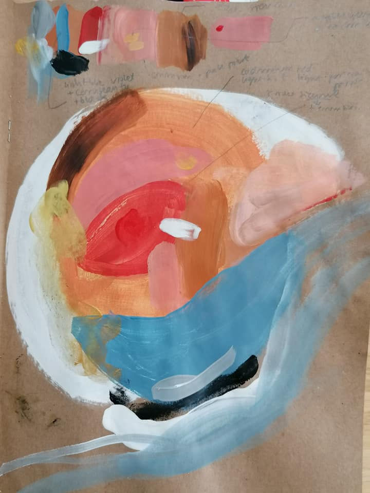
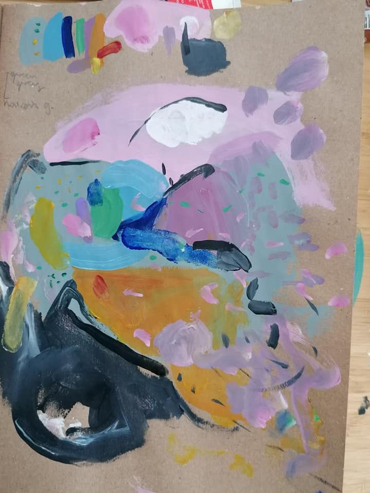
With paint leftovers (our time was up) I created another colour palette. This time without pink underpainting- I was very happy I did so.
I later on used this palette to decide on colours for another composition I prepared for screen printing.

This workshop and creating colour palettes really stayed with me. I've been looking for colour palettes for a few years now. One of my favourite ways has been finding and inspiration from and interior design photo shoot. I would choose a picture, define colour components by painting colour swatches and then doing a quick painting of colour relations and proportions. I would be more or less true to the original photo- it would serve most of all as an inspiration and a starting point.
After the workshop I felt compelled to create series of colour palettes for my curiosities project. I looked through interior magazines and illustrations I find inspiring, and chose those that could relate to the mood I was after.
Below is a photo I worked from for one of my palettes. It's a manipulated photo I took from Elle decoration.

I also made noted for some colours how I mixed them for future reference.
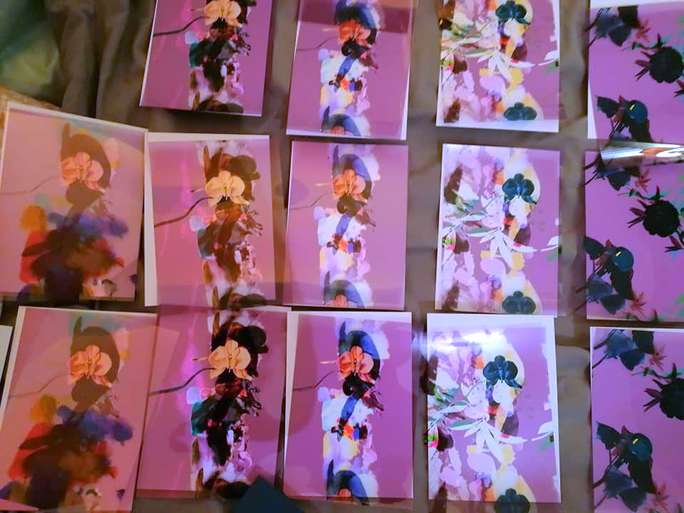
Below are more palettes created this way:


Comments